How To Use the Data Explorer
This topic explains how to use the Data Explorer to view the metrics that F5 NGINX Controller collects.
The Data Explorer lets you perform these following tasks:
- Easily switch between contexts, metrics, and dimensions
- Specify a time range of interest
- Set the aggregation mode
- Compare results to previous periods
- Export the query that’s used to generate the charts as a URL, which you can use outside of NGINX Controller
To get started with the Data Explorer, you need to select the context for the data you want to view.
- Open the NGINX Controller user interface and log in.
- Select the NGINX Controller menu icon, then select Analytics > Explorer.
- On the Data Explorer detail page, select a context area – Instances, Environments, Gateways, or Apps – for which you want to view data.
When you access the Data Explorer from other areas of the browser interface, the context is already defined. So, for example, if you select Data Explorer from within the Instances module (Infrastructure > Instances > Data Explorer), the data for your instances is displayed. When you switch between contexts, the metrics options, such assystem.cpu.idleorsystem.load.5, are updated.
When you select the context for the Data Explorer, a list of related resources is shown. If there aren’t any related resources for the selected context, you’ll see the message “No Data” on the Data Explorer detail page.
If you don’t see a resource in the list, but you expect it to be there, check the selected metric and the selected time range. When a resource doesn’t have the data for the selected time range it won’t be added to the resources list.
To view data for a resource, select the resource’s name from the resource list.
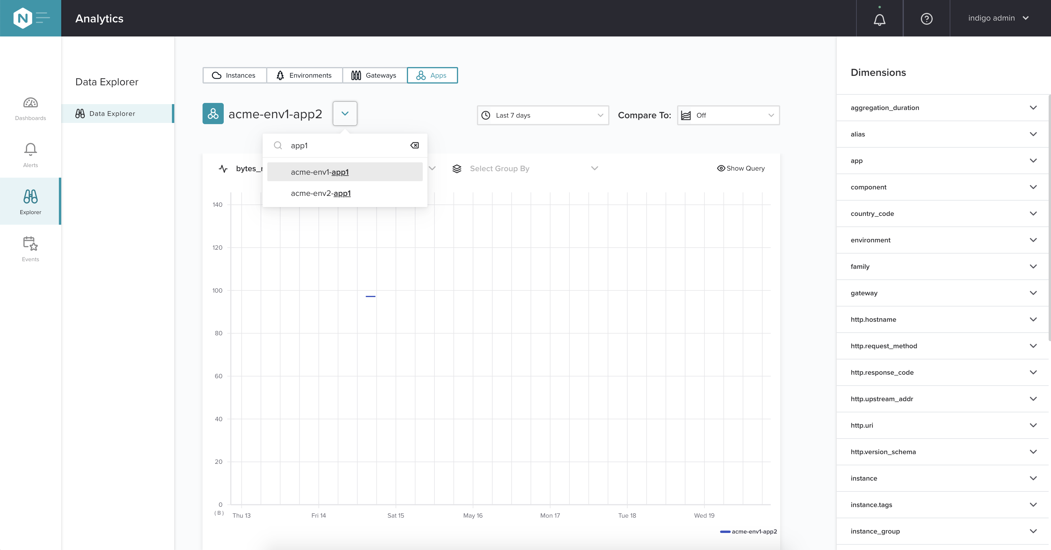
The list of metrics is sorted alphabetically, and you can use the search feature to filter the list. As previously mentioned, the list of metrics depends on the context you’ve selected for the Data Explorer. For example, if you’ve chosen Instances for the context, then the list of metrics will be for instances.
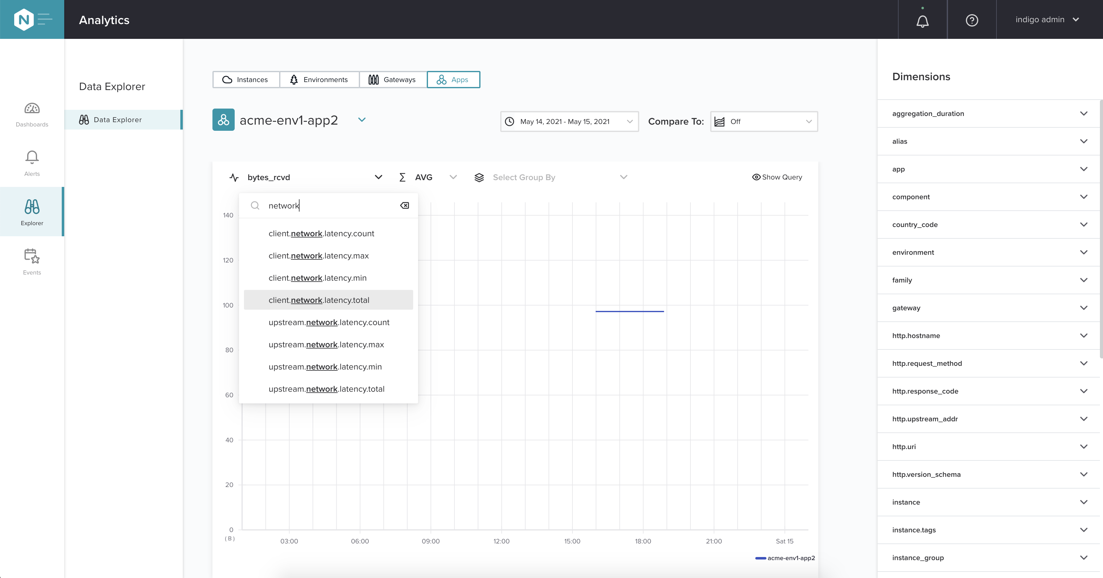
When the selected metric changes, the Aggregation and Group By selectors are updated correspondingly (as well as the list of resources and the Dimensions panel). Some metrics have different lists of Aggregation and Group By values. For example, the http.response_code dimension, which is a valid Group By value for the http.request.count metric, is not available for the nginx.workers.cpu.user metric because these items are from different contexts and aren’t related to each other.
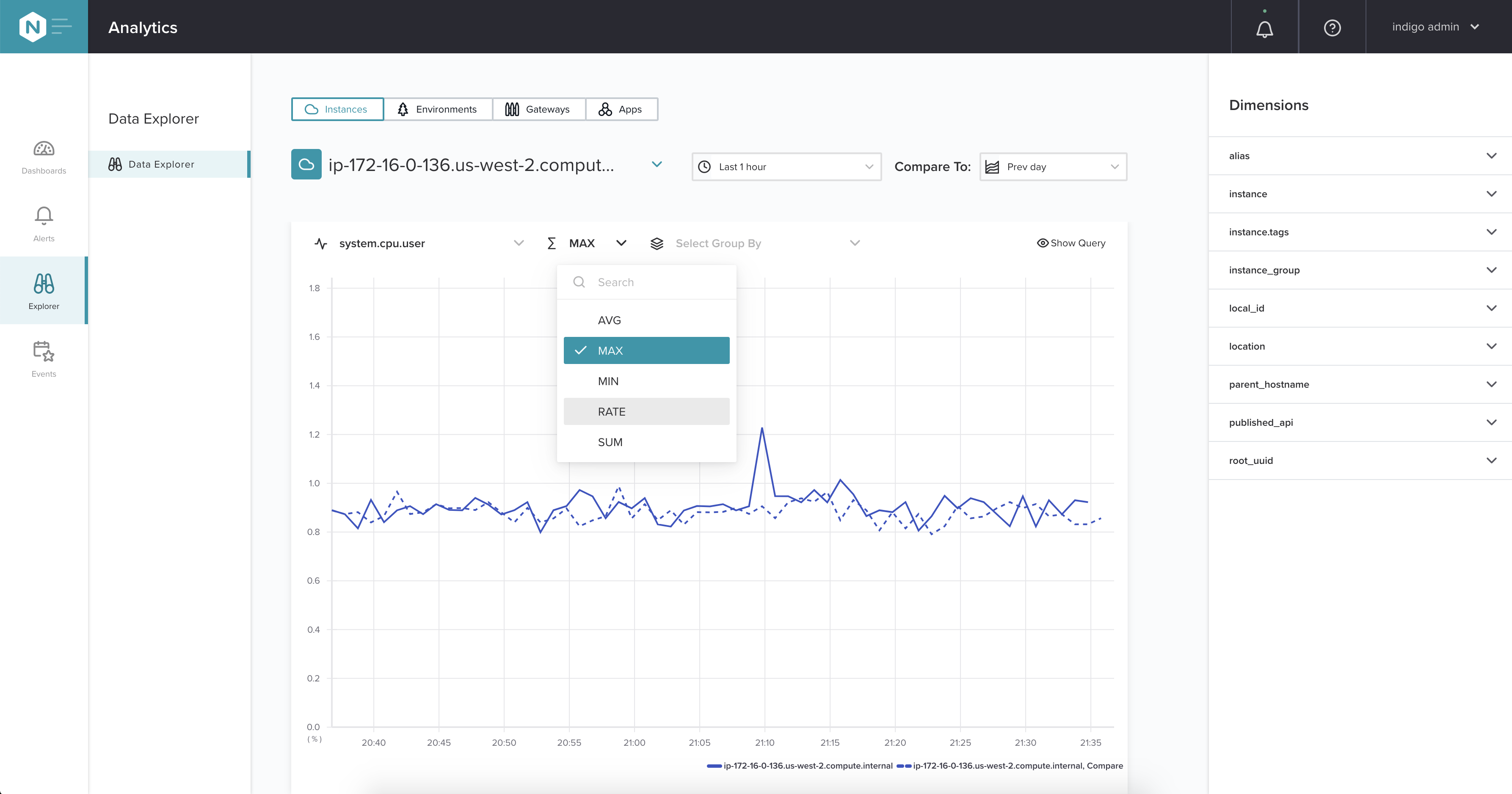
Use the Aggregation selector – the Σ symbol with possible values of AVG, MAX, MIN, RATE, and SUM – to aggregate the data. The list of possible aggregation values depends on the metrics that’s selected.
Use the Group By selector to group the data by a chosen dimension.
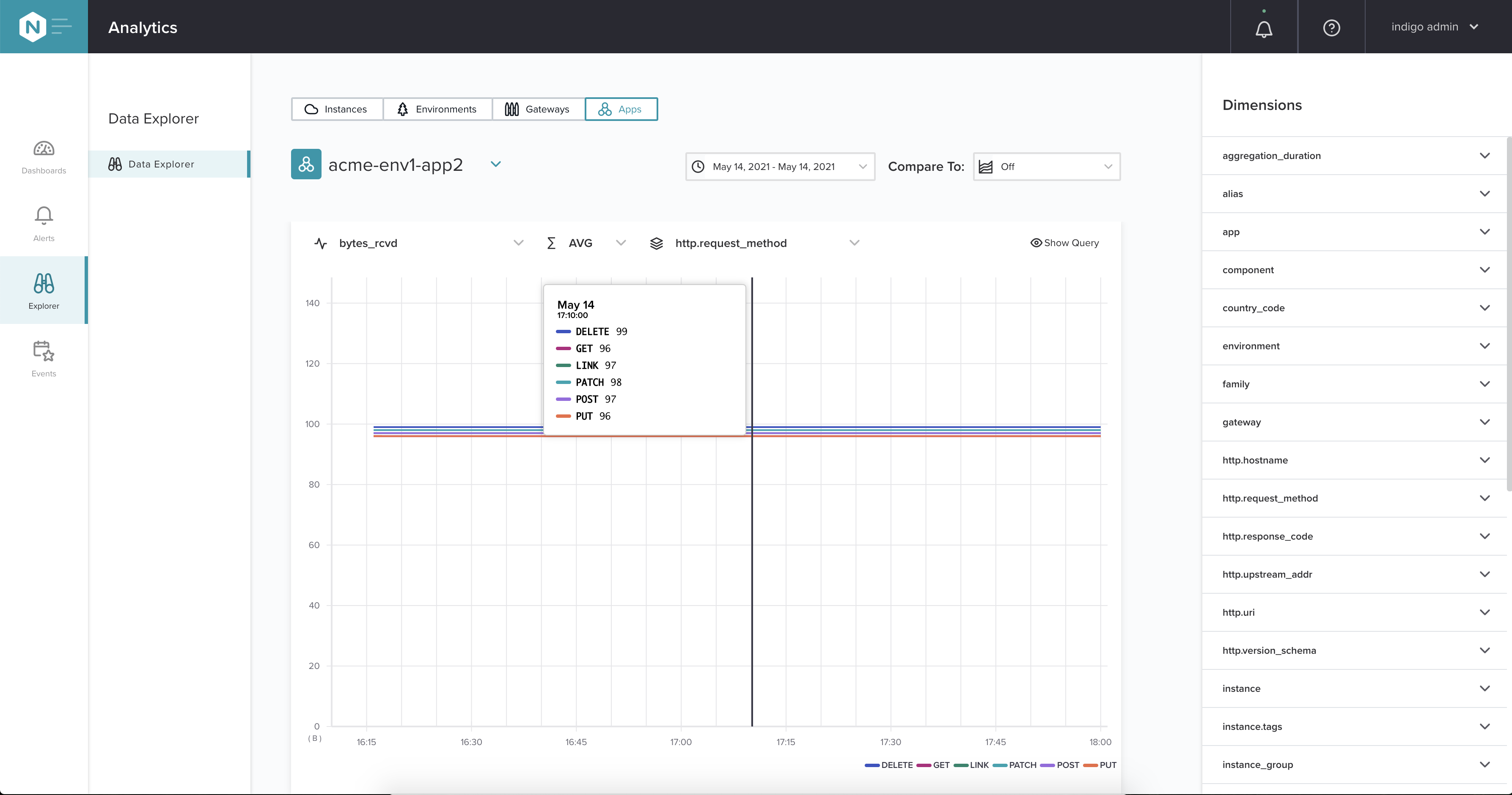
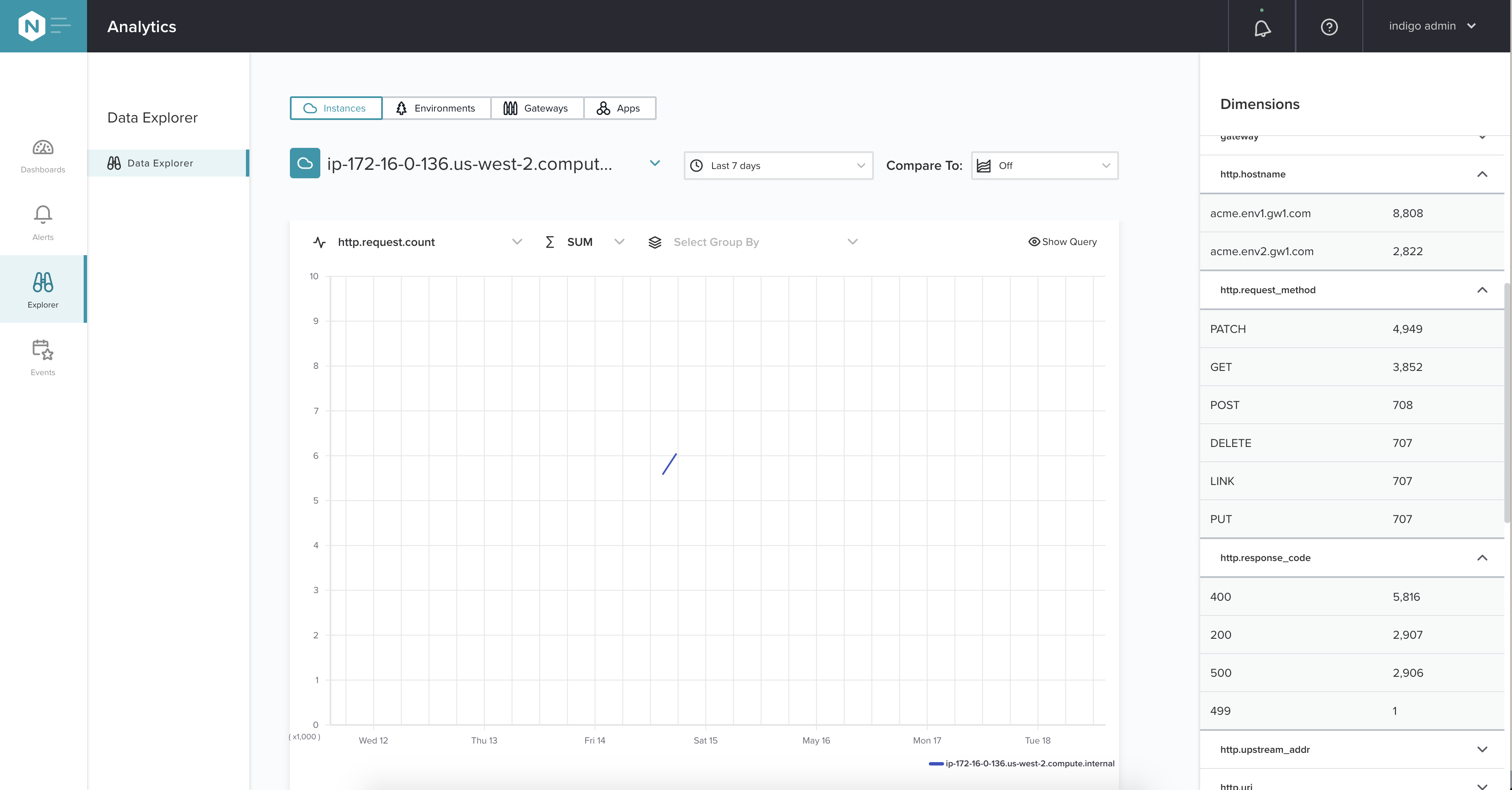
In the following example image, the data for the bytes_rcvd metric is grouped by the dimension http.request_method, which displays a data series for the HTTP methods DELETE, GET, LINK, and so on.
When a Group By selection is applied, the chart displays a top-10 data series. For example, let’s say you want to check disk usage, so you select the metric system.disk.total and file_path as the dimension to group by. The chart would then display the top-10 mount points with the highest values. If you have more than 10 mount points, you’ll see the top-10 mount points plus an 11th data series that’s an aggregation of the rest of the data using the same selection criteria. In other words, you’ll see a chart of the 10 most used mount points plus a chart of all the other mount points aggregated into one data series. When a Group By dimension is selected, and there are more than 10 dimensions, the 11th data series is named “Other.”
When MIN is selected as the aggregation method, the top-10 series are sorted ascending, lowest-to-highest. For all of the other aggregation methods, the top-10 values are sorted descending, highest-to-lowest.
Use the time range selector above the chart to select the time range you want to examine. You can specify a custom time range if the predefined options aren’t what you need.
The granularity of the data series is based on the selected time range and can vary from 30 seconds to five days to make the chart easier to read.
When you change the time range, the list of resources is updated correspondingly and it only includes the resources which have the data for the selected time range.
Next to the time range selector, you’ll find the Compare To list of options. This list allows you to compare data for the selected time frame with data from an earlier period. For example, you may want to view CPU usage for the last hour and compare the results to the same time from yesterday, last week, or even the previous year.
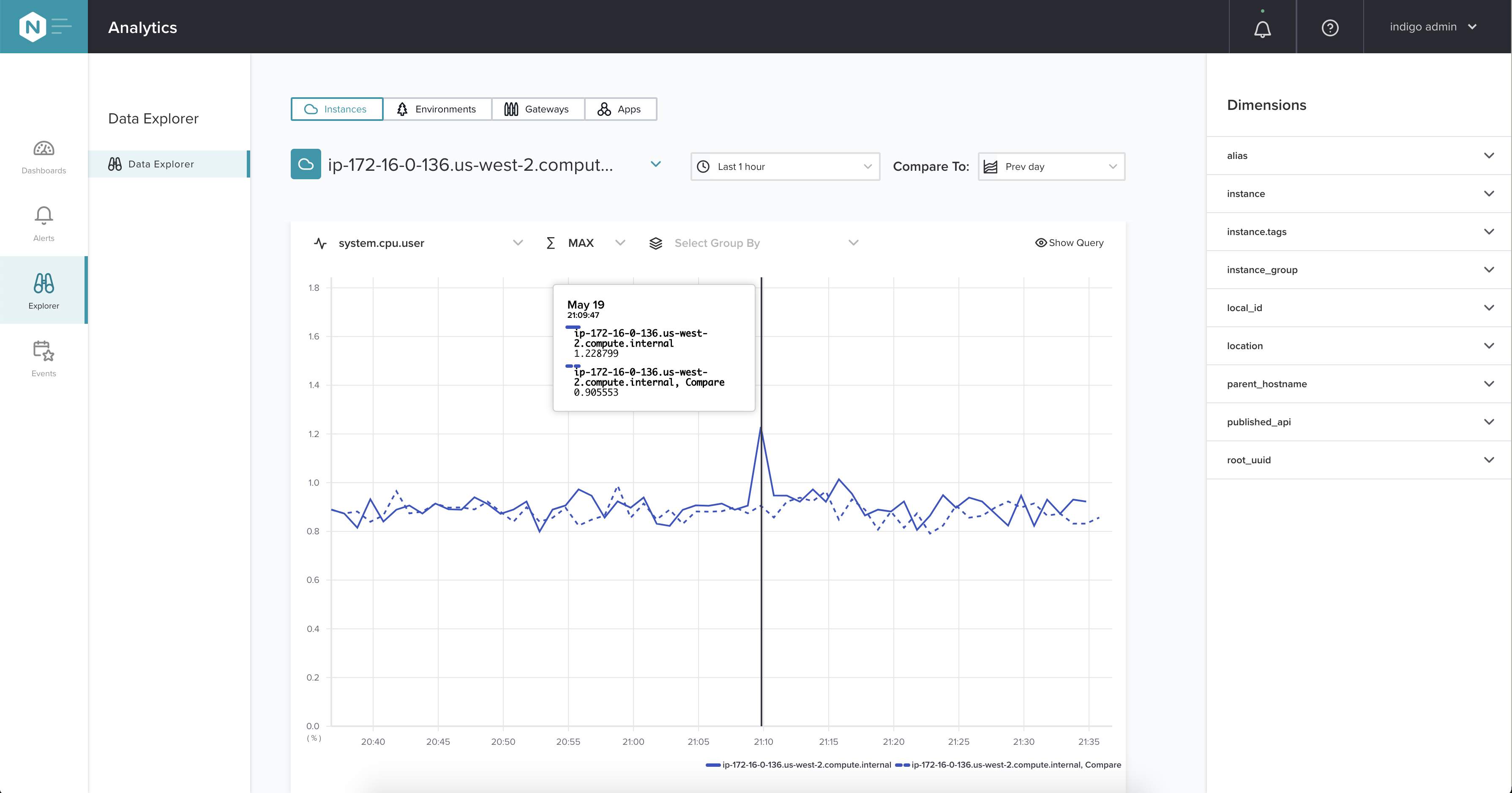
- When comparison is turned on for a data series, the data have the suffix “Compare” in their names.
- If there is no data available for a comparison period, the comparison data series is not shown.
- When a Group By dimension is applied, data comparisons are made only with the top-10 data series and not with the “Other” series, if there is one. See the Group By section for a discussion of the top-10 and “Other” series.
On the Data Explorer details page, you can select the Show Query button (eye icon) to view the URL that’s used to query the Metrics API to get the data you see in the chart. If you copy the query and use it outside of NGINX Controller, you’ll get the same data but in JSON format.
The query updates whenever the selection options change. The query doesn’t include requests for comparison data.
For instructions on how to understand the Metrics API response, refer to the topic Using the Metrics API.
On the right of the screen there is a panel with the list of dimensions available for the selected metric.
Each dimension is presented as a section in which you can expand and see the values for it. The values are aggregated with the selected aggregation method for the selected time range. They depend on the following selected parameters:
When one of the parameters changes, you’ll see the values for expanded dimensions are also updated.
You can see only top-10 values for each dimension, and based on the selected aggregation, they are sorted in following ways:
- When MIN is selected as the aggregation method, the top-10 series are sorted ascending, lowest-to-highest.
- For all of the other aggregation methods, the top-10 values are sorted descending, highest-to-lowest.
- When the selected metric changes, the list of dimensions may change as well, and some of the dimensions you recently explored may disappear from the panel.
- This panel was added in NGINX Controller v3.18.
This documentation applies to the following versions of NGINX Controller: 3.17, 3.18, 3.18.1, 3.18.2 and 3.18.3.
This documentation applies to the following versions of NGINX Controller API Management module: 3.18, 3.18.1, 3.19, 3.19.1, 3.19.2, 3.19.3, 3.19.4 and 3.19.5.
This documentation applies to the following versions of NGINX Controller App Delivery module: 3.20, 3.20.1, 3.21, 3.22, 3.22.1, 3.22.2, 3.22.3, 3.22.4, 3.22.5, 3.22.6, 3.22.7 and 3.22.8.