Dashboards
Learn about the Dashboards page of the User Interface.
You can create your own dashboards populated with highly customizable graphs of NGINX and system-level metrics.
Some of the use cases for a custom set of graphs are the following:
- Checking NGINX performance for a particular application or microservice, e.g. based on the URI path
- Displaying metrics per virtual server
- Visualizing the performance of a group of NGINX servers — for example, front-end load balancers, or an NGINX edge caching layer
- Analyzing a detailed breakdown of HTTP status codes per application
When building a custom graph, metrics can be summed or averaged across several NGINX servers. Using metric filters, it is also possible to create additional “metric dimensions” — for example, reporting the number of POST requests for a specific URI.
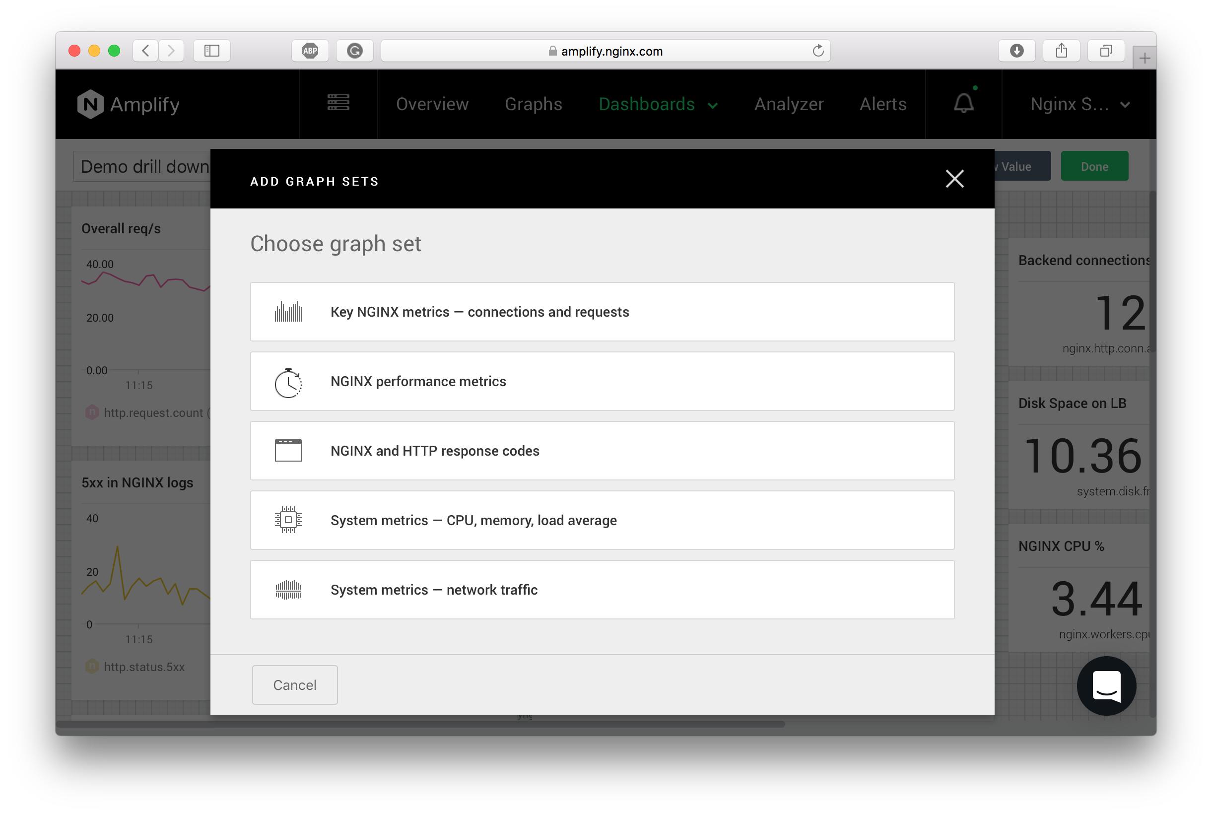
To create a custom dashboard, select CREATE DASHBOARD on the Dashboards drop-down menu. You can choose to quickly build several graphs from a preset to populate your custom dashboard with useful visualizations, or you can create your graphs from scratch.
To start with a graph set wizard, select New Set.

Select New Graph in the upper right corner to start adding graphs to the dashboard.
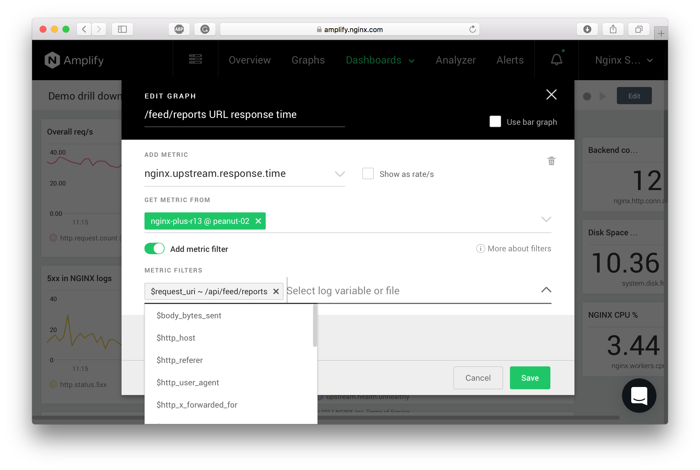
When adding or editing a graph, the following dialog appears:

To define a graph, perform these steps:
- Enter the graph title.
- Pick one or more metrics. You can combine multiple metrics on the same graph using the “Add another metric” button.
- After the metric is selected, you can see the systems for which the metric has been observed. Select one or multiple systems here. You can also use tags to specify the systems.
- When aggregating across multiple systems, select either “Sum” or “Avg” as the aggregation function.
- Last but not least, the “filter” functionality is also available for NGINX metrics collected from the log files. If you select “Add metric filter”, you can add multiple criteria to define specific “metric dimensions”. In the example above, we are matching the NGINX upstream response time against the /api/feed/reports URI. You can also build other filters, e.g., displaying metric nginx.http.status.2xx for the responses with the status code 201.
- Select “Save” to add the graph to the dashboard. You can also edit the graph, move it around, resize it, stack the graphs on top of each other, etc.
Note:
When using filters, all the “metric dimensions” aren’t stored in the F5 NGINX Amplify backend by default. A particular filter starts to slice the metric according to the specification only after the graph is created. Hence, it can be a while before the “filtered” metric is displayed on the graph — the end result depends on how quickly the log files are being populated with the new entries, but typically you should see the first data points in under 5 minutes.
Because NGINX Amplify is not a SaaS log analyzer, the additional slicing for “metric dimensions” is implemented inside NGINX Amplify Agent. NGINX Amplify Agent can parse the NGINX access logs on-the-fly and extract all the necessary metrics without sending the raw log entries elsewhere. Moreover, NGINX Amplify Agent understands custom log formats automatically, and will start looking for various newly defined “metric dimensions” following a particular log_format specification.
Essentially, NGINX Amplify Agent performs a combination of real-time log analytics and standard metrics collection (e.g., metrics from the stub_status module). NGINX Amplify Agent does only the real-time log processing, and always on the same host where it is running.
Metric filters can be really powerful. By using the filters and creating additional “metric dimensions”, it is possible to build highly granular and informative graphs. To enable NGINX Amplify Agent to slice the metrics you must add the corresponding log variables to the active NGINX log format. Please see the Additional NGINX metrics section below.
Metric filters are available only for the metrics generated from the log files. For other metrics some additional modifiers can be set when editing a graph. E.g., for NGINX Plus it is possible to specify the status API zones to build more detailed visualizations.
While editing the dashboard, you can also use additional features like “Clone” to streamline the workflow.